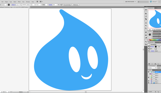
I have decided to change the branding for AquaMorph Productions. In the over four years of AquaMorph Productions existence the branding has changed many times. This newest change brings a brand new logo and a slight adjustment of colors. The color change isn’t all that noticeable. The color scheme is pretty much the same. I just adjusted the colors slightly so they blend better together. Now the logo is a much larger change. I decided to change the logo for a two reasons. The first reason is I really wanted a logo that was one color. The second reason is I wanted a more simplistic logo. The simpler the logo the more memorable. Simple logos also look better when small. I spent a day designing the logo and took people suggestions to improve the design. I then waited to the next day to get a fresh look at the logo and make some minor tweaks. Waiting a day to make a graphic design decision helps me to let go of my feelings for my design and look at it from a detached perspective.
Now it is the time to enjoy my previous brand designs and “logos.” I have learned quite a lot about graphic design of the years and to be honest I have created some pretty horrifying things. That is all part of learning. You make mistakes and learn from them. So enjoy my many lessons is design.
2013
![]()
2012
![]()
2011
![]()
2010
![]()
2009
![]()
2008
![]()